

Jeff McClurken and I have been working on a project for his History of American Technology and Culture course that I am pretty excited about. I’m digging this one in particular because it highlights some of the unique possibilities of building an exhibit of student research in WordPress Multi-User. But before I get started, I should note that this course has a long tradition of experimentation and that this incarnation is just the latest iteration in a long line of online presentations. Jerry Slezak and Jeff have explored everything from Netscape Composer back in the day to MediaWiki last year. But we all knew that when I got my hands on this mother it would be WPMu time, right? Right. So let’s proceed.
Here’s the deal, there are 21 students in this class, each of which will be thoroughly investigating a technology of their choice. The range of which is fascinating, this year’s group moves from the zipper to toilet paper to the mobile phone to global positioning systems (with a wide range in between). I love the array of technologies from various moments in American culture, it makes for a rich and complex understanding of the very idea of what a technology is and how it relates to our culture at any given moment. McClurken rocks! A number of years back everyone in the course would make their own Netscape Composer sites—many of which were quite good. One of the issues with this approach—beyond the fact that Netscape Composer is now outdated—was that a wide range of different layouts and presentations often made it difficult to present and navigate the research as the larger product of a course. Although, it does preserve and present the individual’s research project quite nicely.
More recently MediaWiki was used, and I think their were some improvements there, but for me MediaWiki is increasingly becoming a bear between spam, a lack of a user-friendly text editor, and a brand new formatting language—however basic. In fact, I am more and more convinced MediaWiki is a technology of extremes–it is really only useful for huge projects with hundreds or thousands of participants, or just one. The middle ground is often far more work and maintenance than need be, and do feel free to fight me on this—I’m feeling ornery and could use a good throw down. What’s more, while getting one’s own work out of MediaWiki isn’t difficult, it’s having your own MediaWiki to post it in that may prove impossible (and here’s where a project like this in Wikipedia may be interesting–if not difficult). That said, it’s easy enough to reformat a series of MediaWiki pages for a blog or straight HTML, but there is some additional work involved and we just added several more steps.
Given my sense of the limitations of these two options, and thanks to Jeff’s willingness to experiment, I suggested we actually build the exhibit of student research in UMW Blogs with a customized theme. The logic is as follows; once each student selects the technology they will be researching, they create their own blog with the technology name in the subdomain. For example, a student researching the Birth Control Pill would create a blog along the lines of this URL: http://thepill.umwblogs.org/. After that, we make available a lightly hacked theme that every student in the class will use to provide a consistency of templates across the 21 students’ research sites. As for the content, Jeff provided the class with specific guidelines outlining the aspects of the technology they need to research, and by formalizing these elements as pages within their own sites we came up with some rather simple steps for creating their site using this class-wide template (you can see them here) .
In other words, the 21 different students create their own blogs wherein they publish their research according to a specific format, they choose a common theme (which is lightly hacked) that creates and over-arching means of navigating the work of the entire class. The homepage is simply a blog Jeff created which contains the iconic images that link to each of the student’s research, along with information about the contributors and an about page. What’s nice about this is that each of the blogs are independently administered and created by the students, so they can export their work as they see fit, or even import it into another blog or portfolio space and organize and theme it as they want.
What’s so cool about this in my mind is that it takes so little effort, I used slightly hacked K2 theme to give the sense of consistency amongst 22 different blogs, and the ability to move easily amongst the distributed research is powerful because the illusion of some kind of visual whole is preserved—while the fact that it’s an individual’s own research that they control remains intact. The students’ research and the exhibit site are still works in progress at this point, but it should be done within the next couple of weeks, and I’ll probably be blogging it again. But, in the mean time, if anyone is interested in reading about the simple theme hacks I used to accomplish this, take the jump with the link below.
I stuck with K2 because I know it inside and out, and I still think the theme is rather elegant an simple in its layout, even if over-used. To make this theme a unique option within UMW Blogs, I simply put a new screenshot.png file in the theme with a shot of the new theme as well as added the following to the top of the styles.css file (what I added is in red):
/*
Theme Name: American Technology and Culture Class Theme
Theme URI: http://getk2.com
Description: Configure from the K2 Options Panel. Visit the support forums,
the wiki or the bug tracker.
Developed by Michael, Chris, Zeo,
Steve and Ben Sherratt.
Protected by GPL.
Version: 0.9.1
Author: Various Artists
Author URI: http://binarybonsai.com

CSS Documentation: http://k2.stikipad.com/docs/show/CSS+Overview
*/
So that will take care of distinguishing this class specific themes from an existing K2 theme.
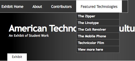
Now, the only hacks I used were in the header and CSS, I basically created an additional navigation bar in the top-left corner of the header that would show up for anyone that is using this specific theme. There are probably better ways to do this (and I would love recommendations) but I used Suckerfishes Multi-level Drop Down Navigation bar CSS generator. I actually only need one level, but I liked the drop down and that they created the CSS for me—there is also an accompanying WordPress Plugin, but I didn’t see the need for it with this hack.
So, I generated some CSS and copying it into the bottom of the hacked K2’s Style Sheet (style.css). After that, I just tweaked it a bit, and while I’m sure I don;t need all of the CSS below, it was easy enough to generate and who am I to waste good CSS that I can’t write:
#suckerfishnav {
    background:#333 ;
    font-size:12px;
    font-family:'Trebuchet MS', Verdana, Sans-Serif;
    font-weight: normal;
    width:55%;
    }
#suckerfishnav, #suckerfishnav ul {
    float:left;
    list-style:none;
    line-height:40px;
    padding:0;
    border:1px solid #aaa;
    margin:0;
    width:55%;
    }
#suckerfishnav a {
    display:block;
    color:#ffffff;
    text-decoration:none;
    padding:0px 15px;
    }
#suckerfishnav li {
    float:left;
    padding:0;
    }
#suckerfishnav ul {
    position:absolute;
    left:-999em;
    height:auto;
    width:142px;
    font-weight:normal;
    margin:0;
    line-height:1;
    border:0;
    border-top:1px solid #666666;
    }
#suckerfishnav li li {
    width:140px;
    border-bottom:1px solid #666666;
    border-left:1px solid #666666;
    border-right:1px solid #666666;
    font-weight:bold;
    font-family:'Trebuchet MS', Verdana, Sans-Serif;
    }
#suckerfishnav li li a {
    padding:5px 5px;
    width:140px;
    font-size:11px;
    color:#fff;
    }
#suckerfishnav li ul ul {
    margin:-33px 0 0 120px;
    }
#suckerfishnav li li:hover {
    background:#fff;
    }
#suckerfishnav li ul li:hover a,

#suckerfishnav li ul li li:hover a,

#suckerfishnav li ul li li li:hover a,

#suckerfishnav li ul li li li:hover a {
    color:#333;
    }
#suckerfishnav li:hover a,

#suckerfishnav li.sfhover a {
    color:#333;
    }
#suckerfishnav li:hover li a,

#suckerfishnav li li:hover li a,

#suckerfishnav li li li:hover li a,

#suckerfishnav li li li li:hover li a {
    color:#fff;
    }
#suckerfishnav li:hover ul ul,

#suckerfishnav li:hover ul ul ul,

#suckerfishnav li:hover ul ul ul ul,

#suckerfishnav li.sfhover ul ul,

#suckerfishnav li.sfhover ul ul ul,

#suckerfishnav li.sfhover ul ul ul ul {
    left:-999em;
    }
#suckerfishnav li:hover ul,

#suckerfishnav li li:hover ul,

#suckerfishnav li li li:hover ul,

#suckerfishnav li li li li:hover ul,

#suckerfishnav li.sfhover ul,

#suckerfishnav li li.sfhover ul,

#suckerfishnav li li li.sfhover ul,

#suckerfishnav li li li li.sfhover ul {
    left:auto;
    background:#333;
    }
#suckerfishnav li:hover,

#suckerfishnav li.sfhover {
    background:#ffffff;
    }
After that, I went into the header.php file and added the following lines unordered list with a tab of nested links for the drop down menu (everything I added is in red, and the links that show up below shoudl actually be a href link HTML, I just can;t get the code to paste in this post correctly:
>
American Technology and Culture
##Notice the link in the header has been removed.
An Exhibit of Student Work
#primary2 {
width: 780px;
float: left;
padding: 20px 0 10px;
margin: 0 5px 0 5px;
display: inline;
}
After that, I just hacked a new page template that looks like the following and selected that as the template for the front page of the exhibit site. It looks like this:
'>
',''); ?>
'.__('Pages:','k2_domain').' ', '', 'number'); ?>
Notice there is no get_sidebar call here :)
You’ll notice above that the div id is actually primary2 not primary, which changes the width of the content area in K2. Also, you might notice I deleted the get_sidebar PHP call which basically gives me the single page layout you see on the homepage of the exhibit here.
It may seem like a lot to some, but anyone who knows anything about code knows that this is the most basic of hacks, and that’s what I like about it. It’s dead simple, and the effect is rather powerful—it’s kind of like the Dude’s rug, it really brings the room together.
This entry was posted in UMW Blogs, wordpress multi-user, wpmu and tagged experimentation, Hack, hacks, Jeff McClurken, K2, mediawiki, projects, UMW Blogs, WordPress, wordpress multi-user, wpmued. Bookmark the permalink.
6 Responses to One blog…or many? A Closer Look at “American Technology and Culture”
Leave a Reply to Reverend Cancel reply

I love the idea and I really like the pedagogy of the course — from what I can see. I bet the exhibits are powerful as they all come together. As I was reading this all I could think about how nice this is — not the WP implementation, but the ability to sit down and craft a solution for a faculty member on a one on one basis. I am envious of your ability to partner at that level and to make that kind of investment for a 20 student course. Just great!
Your solution has given me a idea for a similar, yet slightly different approach for our environment. This same approach could be used to build an aggregate course blog dynamically … once students have their blog setup, they could easily submit their URL to let a single faculty blog turn into an aggregate gallery of sorts — the icons could come from students’ profile picture in our Blogs at PSU environment. I am thinking we could create a template set that would basically be a faculty blog space that pulls it all together for them. That way we could do something similar in any course that was living on our blog platform. The biggest complaint we hear is that once the class becomes so decentralized (with each of the students having their own blogs) it becomes tough to pay attention to them all — remember, we are talking about classes that number in the 100s of students.
Thanks for the inspiration! Great design and it is a very transferable idea!
Great stuff. I’ve seen most (perhaps all) of the iterations of Jeff’s web-publishing project in this course, and this one’s looking great. WPMu proves its mettle once again.
I’m trying to imagine how this might work for ongoing blog aggregation, which is what Cole’s commenting on (if I’m reading him right). The trick here is that each of Jeff’s student is compiling a research site, not a blog. The portal or aggregator page wouldn’t work as well as a dashboard for tracking ongoing blogging, would it? Or am I missing something obvious here? (Always a possibility.) I’ve gotten the question about large classes several times recently, and I can’t do much more than talk about RSS readers at this point.
By the way, as a staunch MediaWiki user from way back, I think you’re right about its strengths and weaknesses. I’ve been using Wetpaint for my class this spring and loving it. I’m thinking about springing for a premium account, in fact. All I need to do now is figure out how to use its RSS functionality to get good stuff into the aggregator blog page.
Thanks Jim (and Gardner and Cole) for the kind words about the class. Two points:
1) The student projects are still being worked on, so be sure to check back in a few weeks when they’re all done. First versions are due this Thursday.
2) One of the real balancing issues in the iterations of this assignment has been between the work students need to do to learn the technology and the appearance of the final result. I knew since the start of UMWBlogs that WPMu offered a real way to get the right balance here. However, Jim’s idea to hack a custom WP theme for the class (something I wouldn’t have considered, at least not in my first year as a department chair 🙂 immediately resonated with me and the early results look better than I could have hoped. I do really like the way that it provides a common interface, yet allows some creative room for students to explore and present their research.
Okay, three points. Cole, it’s not just the people in UMW’s Teaching and Learning Technologies who gain from this ability to work one-on-one with faculty and on these smaller classes, it’s the faculty and students in those classes who benefit. I’m amazed every time I sit down with Jerry, Patrick, Martha, Andy, or Jim by how lucky I am to have these partners in teaching….
A simple (as, in retrospect, so many great ideas are) and powerful idea… I’ll be watching to see how it progresses. I wish I were at a point with my institution that scalability was a serious question!
Quick off topic question … is the Bava Top 10 dynamic? How can I be so far behind? Sorry to hijack the discussion!
@Cole,
It is dynamic, and starts from a year ago of the very day. Don;t worry, I’ll give you a boost. Also, I love the idea of hacking templates as aggregator blogs, and like…
@Gardner is suggesting, why not hack a template that acts kind of like a netvibes or Google reader, it would be easy enough. Although the point should be raised, why not just use Google Reader, to which I would respond, “I know, right?” But still, sometimes it just takes an example of the idea, and when you have a kind of reader pace out in the open, that’s kind of powerful and gets the utility of the idea across, which may lead to a Google Reader addiction–who knows.
@Jeff It will be beautiful when it’s done!
@Chris Simple is the key, and we started out first WPMu with all of three courses, it grows quick, or at least has the potential to. Do you have one setup there?