
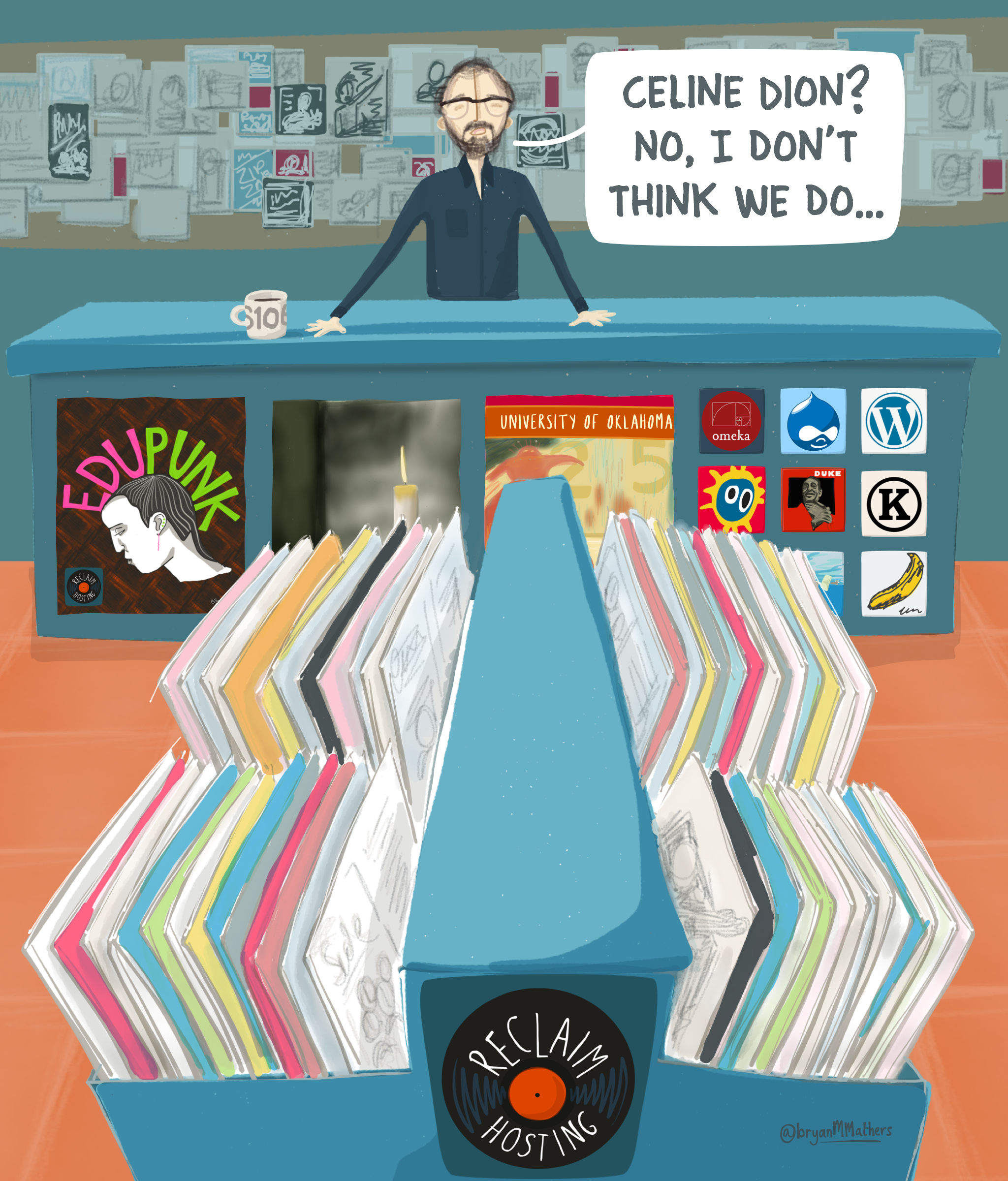
Reclaim Records is starting to get further fleshed out thanks to the latest installment from the great Bryan Mathers. I really love the colors in this one, not to mention the synchronization of all the details we’ve been working on from album covers, to the #ds106 coffee mug, to the awesome EDUPUNK poster (a work of art within the work of art), the smack-talking on Canada, and the figure behind the counter. The idea will be to switch the face of Reclaim—this one presumably me given the hairline and glasses—with caricatures of Tim and Lauren. Each of us behind the counter server up the goods. What this image makes me want more than anything else is a Reclaim storefront.
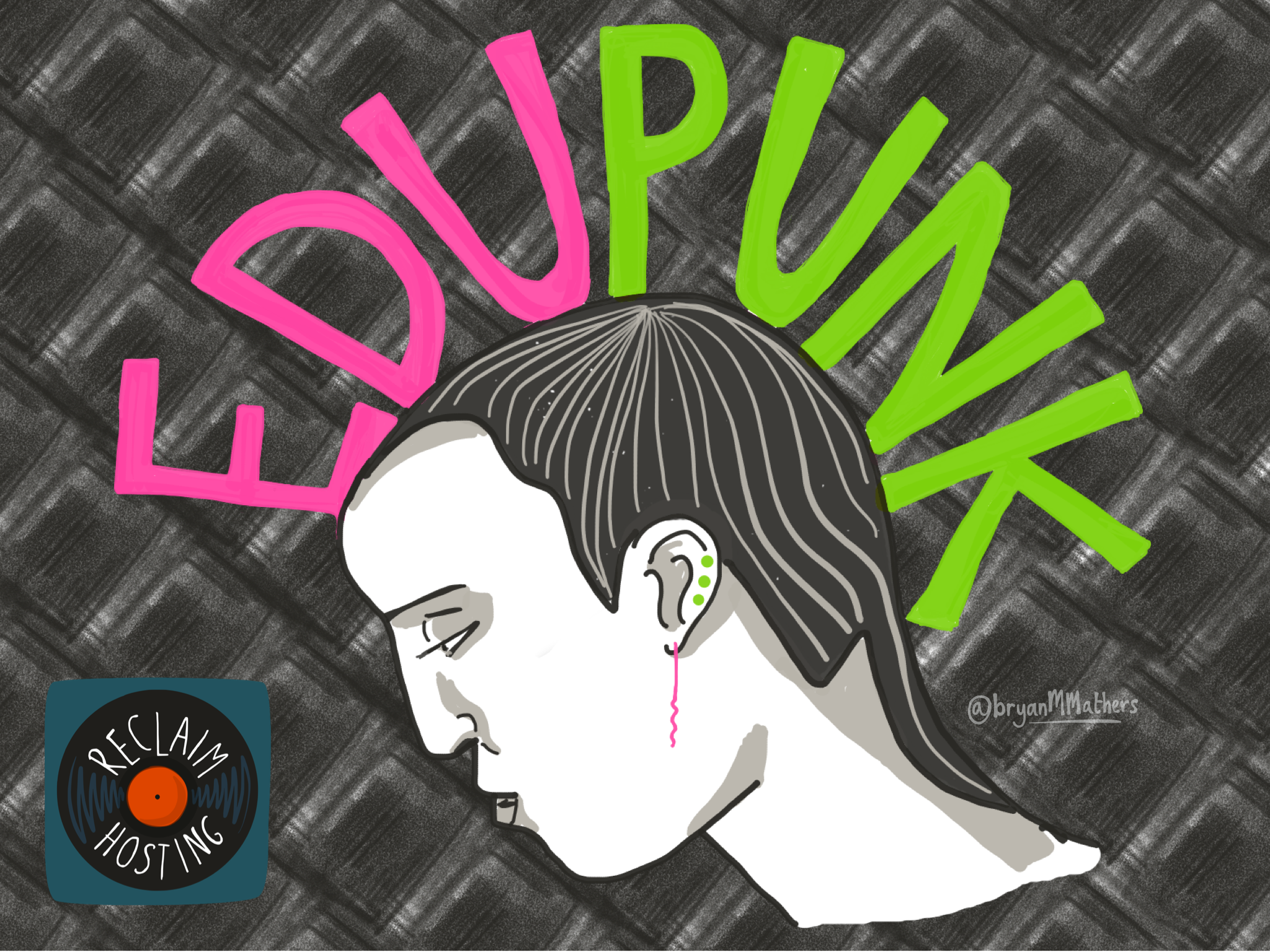
Bryan sent me a larger version of the EDUPUNK poster he created, and I was really blown away by the design. Using the EDUPUNK letters to make the mohawk was brilliant, and the bright, neon 80s colors against the zine-like gray is gorgeous. The whole idea of posters and album art as part of the culture of Indie Edtech is fascinating to me. After announcing a makeshift title for my OER16 presentation as “Open’s Just Another Word for Nothing Left to Lose,” Bryan quickly returned this…
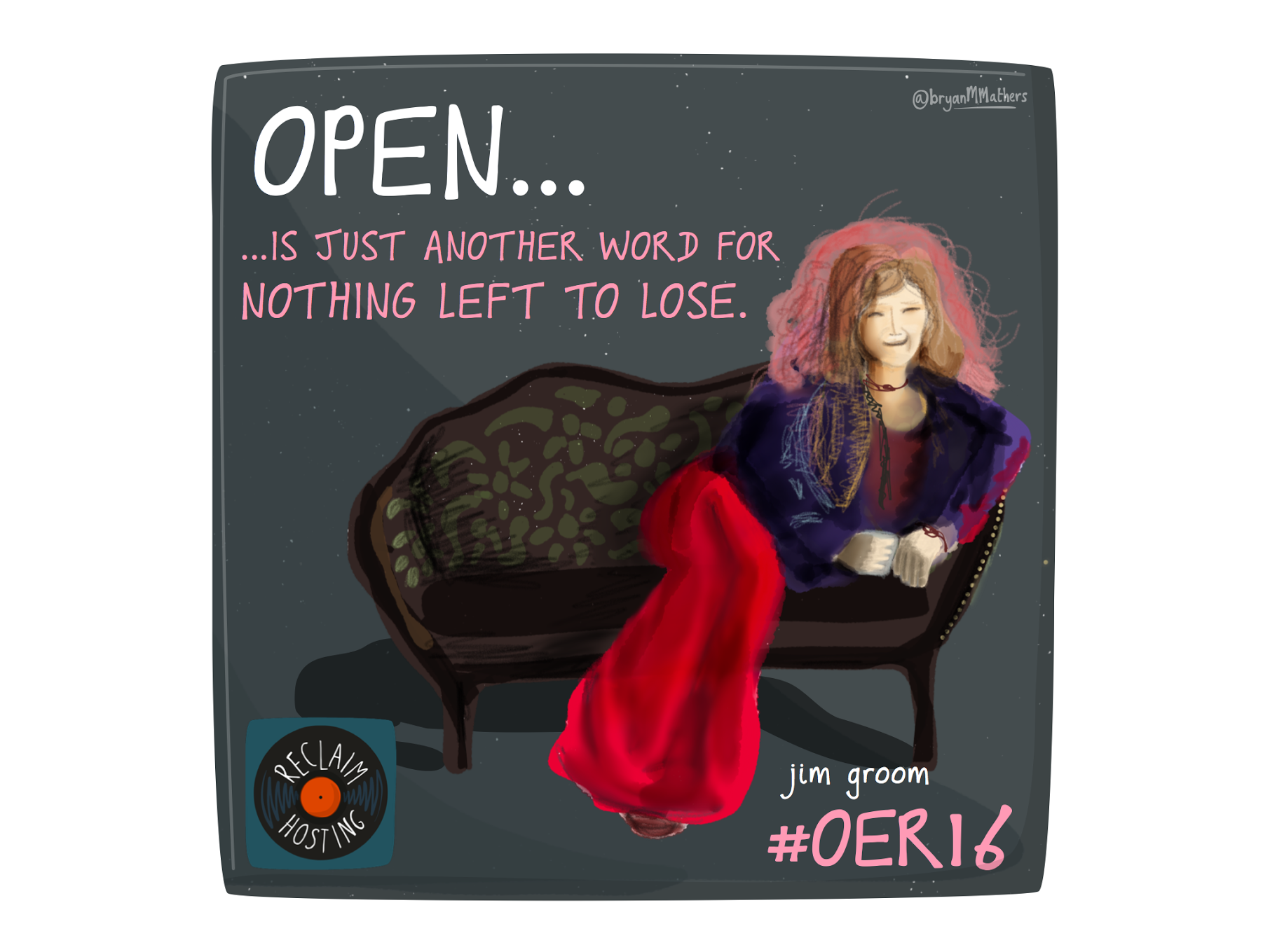 Inspired by the great Janis Joplin on the album cover of Pearl, and many have been quick to see the likeness to another contemporary rock star 🙂 The whole idea of covers and posters as part of an aesthetic for ideas and building a culture is something that I’ve been thinking about a bit lately. One of the coolest things of the 90s alternative music scene was the flier/poster art. I recently bought the book It All Dies Anyway: L.A., Jabberjaw, and the End of an Era, and it features a ton of posters from this era, some cut and pasted in the OG Xeroxed scribble style (designed by Courtney Love!):
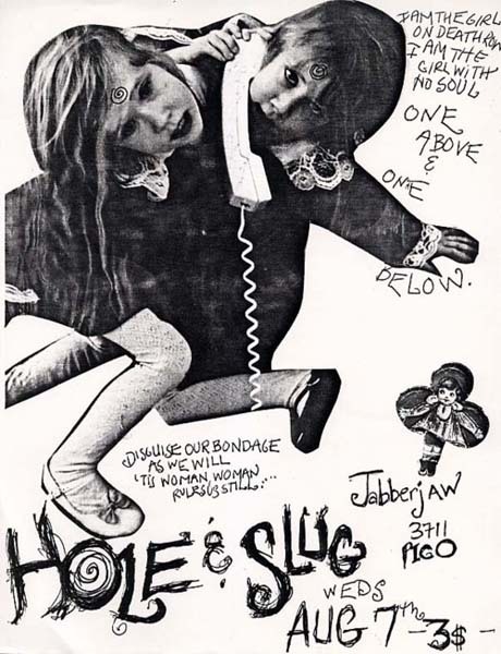
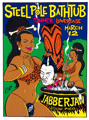
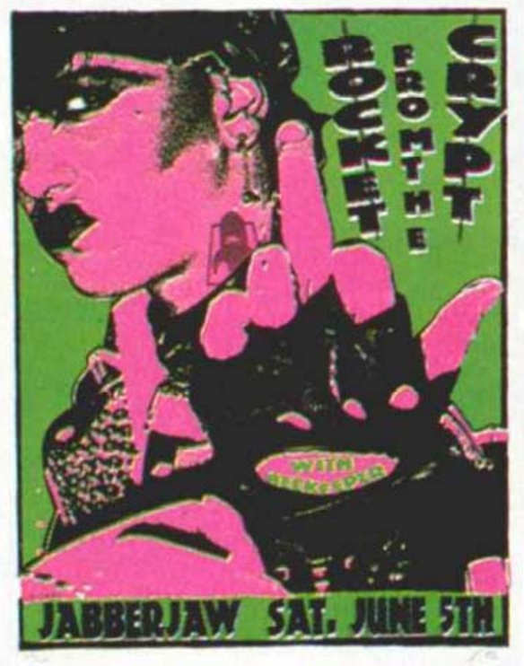
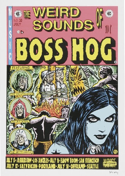
While others in the telltale 90s alternative music poster style by artists like Steve Coop, Lindsey Kuhn, and Frank Kozik..
 Another artist making posters at the time was Chuck Sperry (a.k.a., Psychic Sparkplug), and this Man or Astroman? poster is quite fun.
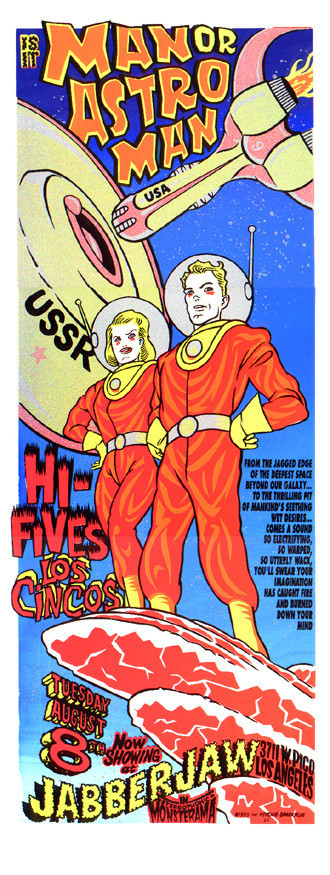 And then there is the flier madness behind the counter that is a yet to be defined collage of 1000 shows. Something like this wall of Riot grrrl fliers.
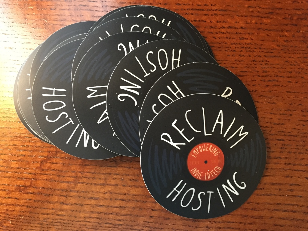
 Bryan Mathers and I will be having another conversation soon, and I am personally interested in aping the style of some of these 90s artists and having fun with this graphic history. But in the meantime Tim has gotten some stickers made of our new logo.
What’s more, we’ll be doing a run of new shirts shortly. Once we get the figures back from the printer, we’ll be opening up the call for 3 days so that anyone who wants one can make an order. Once the order closes we’ll send them to print and then mail them out along with some stickers.

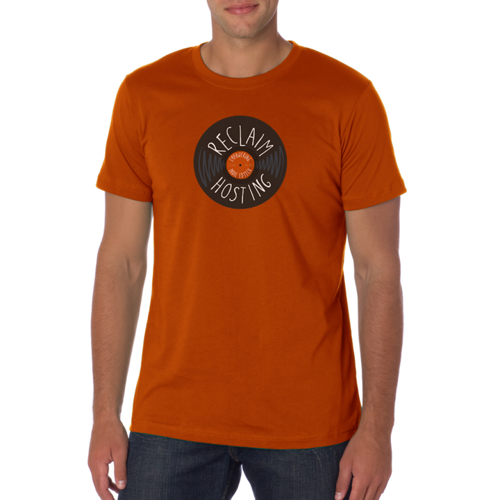
We’ll also have a ladies cut, but we’re still working on finding it in colors similar to those above. So, how’s the Reclaim aesthetic coming along? Is this as fun for you as it is for me?

I expect nothing but the best service from Reclaim Records …
http://www.much.com/wp-content/uploads/2015/05/tumblr_mpjqchJiYI1ssy5nmo1_500.gif