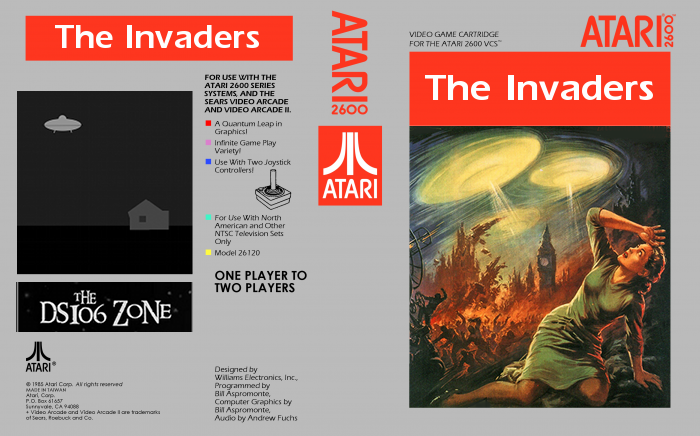
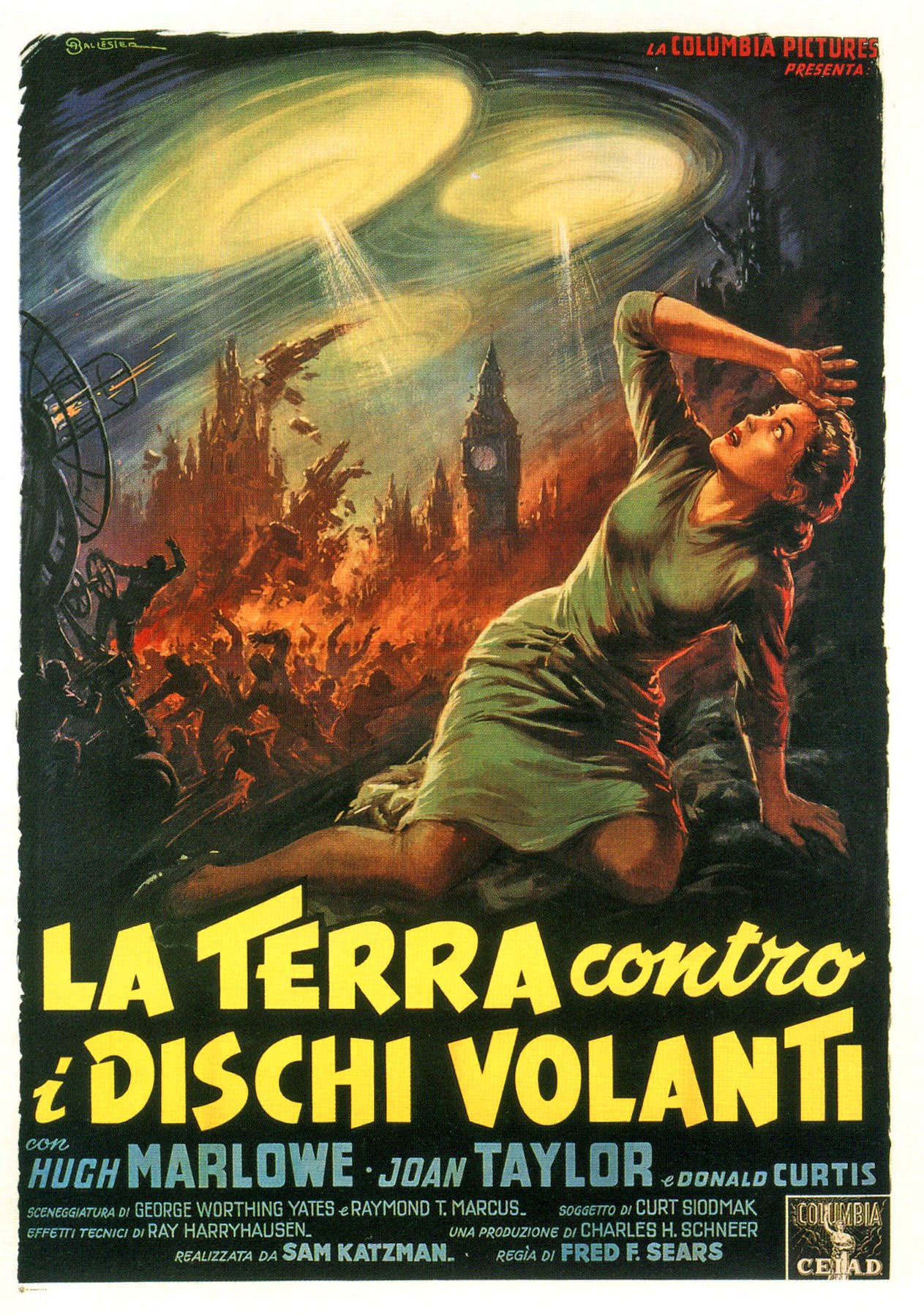
I have a new assignment I’ll post to the repository sometime later, but for now I’m going to give it a preliminary star count of 4 and a half because that’s how many I need right now 🙂 I’ll also post a tutorial shortly, but for the moment this is an old school Atari 2600 cartridge cover—you can find the template here—that I used a 1950s scifi movie poster of Earth vs. the Flying Saucer (1956) to capture an aestheticized version of the Twilight Zone episode “The Invaders.” I got the correct font for the game title from the Atari Age site. Finally, I grabbed the Minimalistic Book Cover for The Invaders Andy Forgrave created to capture the gameplay screenshot on the back cover (it was Andrew’s assignment that inspired this madness). I did this under time-imposed duress, but I’m still happy with how it came out. What’s more, there were so many freely available—and awesome— resources to pull this bad boy together quickly, and it was so much fun, more a design-based mashup than anything else.
Jim, I like this game cartridge cover. While neither image is exactly from the episode, they evoke the concepts of the The Invaders as aliens in flying saucers, and a lonely woman reacting in fear. Of course the game play would include axes, laser beams, bowling the aliens off the roof, and maybe a blanket party for a knife-wielding invader. It is a take-off from the show, probably not paying royalties since the themes are archetypal, titles aren’t copyrighted, and there is no dialogue to quote.
This reminds me of actual DVD case covers I and my family have created to spoof movies. We even made a fake Twilight (the vampire/werewolf movie) cover for our son-in-law who really despised the movie to enclose a generic gift card to the movies.
Spoof DVD covers sounds like an awesome design assignment, you need to share that one post-haste. I would love to see some examples. Also, thanks for the kudos on this one, I had a lot of fun doing it, and I love the web quickly became a mashup of resources to make it happen rather then my own “laboring in solitude” with some mistaken vision of creating great art. The whole genius of the web is creating something compelling has gotten a little easier, it just takes a decent idea and some nostalgia 😉
I absolutely dig this creation. I logged many, many hours on my Atari 2600 with friends and by myself. One of the most salient memories I have about these games was how the package/cover art was (1) compelling, (2) exciting, and (3) NOTHING like the actual game! Your addition of Andy Forgrave’s Minimalistic Book Cover for The Invaders perfectly nails how such a game would have actually looked like on the TV.
@bill I tend to think that what made Atari cartridge boxes awesome was that the cover art sort of mostly kind of applied to the experience contained inside the box. I always think of Atari covers in the same way that I think about the first set piece in a low budget movie (see Punisher War Zone for a great example); THAT is where most of the money in the movie is going, because that’s what the people who made the movie want you to feel through the whole movie even when they CGI/explosions/cast disappear for most of the movie. (Does that make sense? It’s okay, we’re friends, you can tell me).
@jim I want to play this game! Is there a grunt button? And is that button different than the button for banging a hunk of wood under a piece of furniture? Awesome.
Brian: Yes, that makes sense. I had to refresh my memory (ie, Google search) for what Atari 2600 games looked like. I *think* I had one, or something similar, and realize that the graphics and play was pretty simplistic. The graphics of the cartridge and advertising needed to be “applied to the experience contained inside the box,” as you say. After all, that is what most advertising and product design is about: creating an experience the consumer can anticipate, and perhaps the actual experience will be close enough.
Jim: I’ve been searching my old files, and don’t think I still have the DVD covers I made in the past. I actually did the work in Microsoft Word. Images grabbed from the Internet, somewhat modified in Paint, then pasted into Word. Adjusted margins and printing size as needed to get the printout to fit the case. (The Twilight one was done in b&w to simulate a bootleg copy, since it wasn’t released yet.) I’ll consider recreating a design, then making an assignment of it. But, time limited the rest of this week. Can’t even make your hangout today…