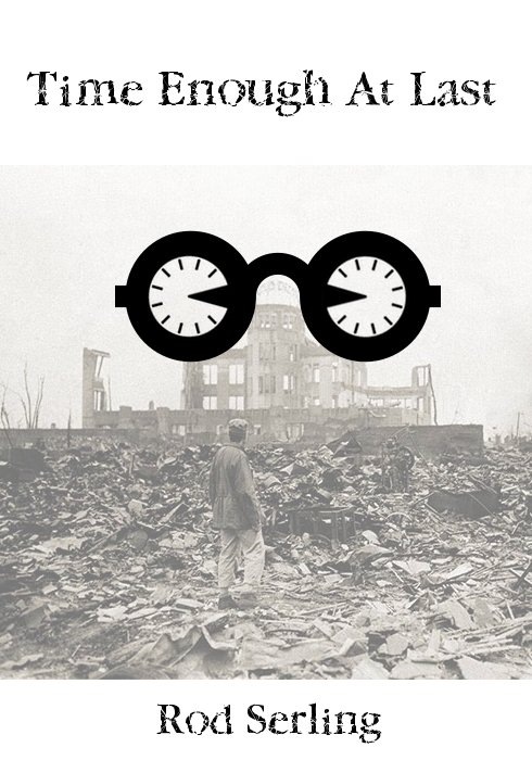
Minimalist Book Cover for Twilight Zon episode “Time Enough at Last”
I am really happy with how this one came out. It was a mashup of things, so let me run you through them quick. I started out thinking about using the iconic symbols in this episode of Twilight Zone, namely the glasses and and the clock, by placing a clock face within each lens.
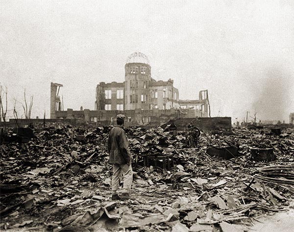
This was the beginning of the idea. I found the glasses and clock icons on The Noun Project. After that I created a new canvas in Gimp that was roughly 700px high and 490px wide with a transparent background. I imported the two icon SVG files and adjusted there sizes, I made the glasses 300 x 300px and kept the clocks at 100 x 100px. Once i selected and moved each layer aroundI had my design, but I though I needed more, which is when I started searching for rubble as a backdrop. I found this insane image of the aftermath of H-bomb in Hiroshima which is hauntingly similar to both the theme and aesthetic of “TIme Enough at Last,” and I knew I would use it. I added it as a backdrop, put its opacity at 50%, and added the book title text at the top and author name text at the bottom using the Twylyte Zone font, although I think I might even like the Ringbearer font better. After that, I added a new layer with a white background and moved the layer so it was the background for all effects. After that, total awesome–what say you? Does the archival image and iconic glasses work for you? I kind like the serendipitous effect of the glasses sitting neatly on the cupola of the building, so cool!
Credits:
Clock icon by Taylor Medlin
Glasses icon by Yorlmar Campos
Hiroshima rubble image
Stars: 3 1/2 (5 1/2 total)
So Gatsby.
Fantastic. I really like this. At first I thought the background was a still from the episode itself–that’s how much it fits, I think. I also like how you turned the clocks into partially-eaten pies (or pac-man’s?) to give a balance to the blocks on the outside of the frames and a kind of focal point in the middle, where the cupola is.
I’m hoping to do an “I can read movies” assignment on this episode (I can read tv series?!), if I get my act together in the next couple of nights! I have some similar ideas as you have here, but the execution will be quite different. Now that I’ve mentioned it in public, maybe I’ll actually get around to doing it.
What really makes an impression for me here is the black and white and shades of gray that create a pathway into the composition: boom, thick dark “clockles” (clock goggles), then the text which is black but fractured and dispersed coming off as a dark shade of gray; we’re pulled in to the washed out gray scale of the image and then we float in white. That’s travelling through the ds106zone.