
I created yet another design assignment for ds106 because I’m just that good. This one is based on the Read poster campaign that started in 1985. Here is the description:
Since 1985, the American Library Association (ALA) has tried to sell reading books as cool by showing celebrities reading their favorite books. You can read about the history of this promotional campaign here. Experiment with this tradition, introduce a celebrity with a book who hasn’t been recognized yet, but should be. Or use the poster you create to poke fun at a public figure, or do something else all together. have fun.
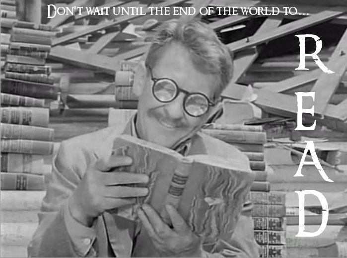
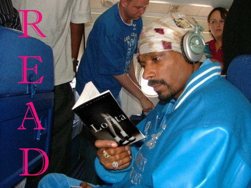
Doing this in photo shop was pretty simple, I got the screenshot from the Twilight Zone episode “World Enough and Time” and added the caption on the top and the READ text on the side using the text tool and trying out the the Ringbearer font, which is very Twilight Zoney. I made it three stars because the real gold would be photoshopping books in famous figures hands, like Bill Clinton with Lolita, etc. Also, I always thought the following image of Snoop Doggy Dogg would make a great read poster, so I did 🙂
Design: 3 stars (8 1/2 so far)

Pingback: To read well is to master the ages | REFRACTIONS
fo drizzle.
Thanks for embedding all the references and I like the fonts you used for the Read posters
Kevin,
Thanks for the comment, ow critique my work, but let me get away with this schlock.