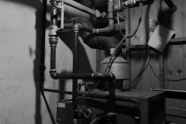
Today’s The Daily Create reinforces for me just how much better looking black and white is than color.
My first shot of the boiler room in my basement is pretty ugly.

But after a little black and white action, not too shabby!

Today’s The Daily Create reinforces for me just how much better looking black and white is than color.
My first shot of the boiler room in my basement is pretty ugly.

But after a little black and white action, not too shabby!

That’s actually why I pretty much never shoot in black and white. It’s a cheap and easy way to make your picture better – a cop out. It’s a lot harder to make colour look good – but a lot more rewarding.
Stephen,
I agree that black and white is easier for a novice like me, but when I watch the Film Noirs of the 1940s I have to acknowledge there are masters who can really pull out the shadows and make the two colors take on new dimensions of intensity. In fact, I particularly liked your shot of downtown Halifax for this assignment, it was beautifully nostalgic, and I think it might have captured something of the city that could be lost with color—in fact, after seeing your original I think the notion of time travel and black and white has it’s own beauty.
Funny, my wife was experimenting with black and white versus color in our backyard this weekend, and I think her color shot (http://www.flickr.com/photos/jimgroom/6661300283/) might be a bit more compelling than the black and white (http://www.flickr.com/photos/jimgroom/6661337341/) —though both are pretty monochrome.
Also, Stephen, anyway you can allow comments on your letsmakesomeartdammit blogger open for anonymous +URl, I keep having issues commenting there because OpenID sucks.
Nobody ever said “cheap and easy” wasn’t also crazy effective. I think the “cop out” is important for people that are just starting to explore a new medium or concept, in order for them to rapidly begin to develop a sense of what makes good art and what doesn’t. The same idea surfaces in the K-12 classroom when students “spam” fancy credits and transitions in iMovie, only to later have a better understanding of how those can be used for effect.
I disagree. Good photo=good photo. Some will work better in color, some better in black and white. I’ve seen plenty of crappy black and white.
I think “thinking” with a focus on black and white shots can result in being more aware of form and light but I don’t see any automatic improvement across photos by simply dropping color.
Tom,
I see what you are saying, but given I am not necessarily a good photographer I find taking out all the extra colors simplifies the photo and makes it more intense. I don;t think either photo is necessarily good here, but the black and white tends to clean up the original color mess. Now I understand how this is different from a good photo = good photo which I see your point and I agree with—suggesting black and white is always better discounts a vision for the medium that accounts for the real difference.
If you like what you’re capturing, qualify yourself as good.
Not to be entirely pedantic but photography, like most things artistic, is almost entirely subjective. Take a look at these famous photographs (with mock Internet commentary). They seem to run the gambit in terms of technical sophistication and I sure wouldn’t ID a few of them as anything special.